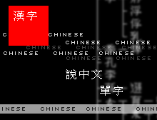
Chinesechinese
Friday, February 27, 2004 » image link thought
I admit that I used to be a pretty regular reader of CNN.com. The way it manages to fit all its little news subcategories and headlines onto about a page and a half is very convenient for the short attention span. As I continued to read the site over a few weeks, though, I became unsatisfied with the relative brevity of most of the articles, as well as annoyed with the numerous typos and errors on every other page. I now think of CNN.com as more of the fast food of news sites.
What CNN.com has that never failed to amuse me, though, were the images that accompanied each article. I'm not talking about the photos of politicians or courtrooms that went along with the typical headline articles, but rather the little throwaway images that, presumably, some graphic designer over at CNN.com has to scrape together each time some less significant story goes to press. They're really nothing special, and that's what I found the most interesting. These aren't even your typical stock photos, either. Usually they're just part of some photo blown up or poorly Photoshopped over a cloudy background, often with some graphic or iconic element thrown in for good measure. For instance, when they ran an article on Jones Soda's Turkey & Gravy variety (which, as it turns out, was apparently only available around the Washington area), the image they had to go along with it was a Photoshopped Thanksgiving turkey next to a generic bottle with brown liquid in it. On top of that, they had done a very unconvincing job of editing the bottle to say "soda" on it. It was even in some ungodly font like Lucida Handwriting that no corporation would ever use. It makes me wonder how they recruit their designers, or if they just have whoever wrote the article put something together in Photoshop themselves.

Anyway, today I came across this article, and its respective image. My first thought was, wow, it sure does say "Chinese" a lot of times. Then I started thinking, how does this add to the article at all? Why even include it? I really like how whoever put this together decided to go with this futuristic motif, with the bitmap text and the Matrix-esque character flowchart, blatantly taken from Zhongwen.com. At least that aspect sort of ties in with the actual article, I GUESS. I'm not really sure what the red box is trying to accomplish, though.
Post a comment